Web Design in 2026 Is Not What It Used to Be (And That's a Good Thing)
There was a time when web design trends boiled down to choosing a nice typeface, a brand color, and a template that wouldn't break on mobile. That time is over. In 2026, web design is a discipline where artificial intelligence, technical performance, real accessibility, and a deep understanding of how users interact with digital interfaces all converge.
This article isn't a surface-level list of trends with fancy names. We're going to analyze what's actually changing, why it matters for your business, and how you can apply each concept practically — whether you're redesigning your current website or building one from scratch.
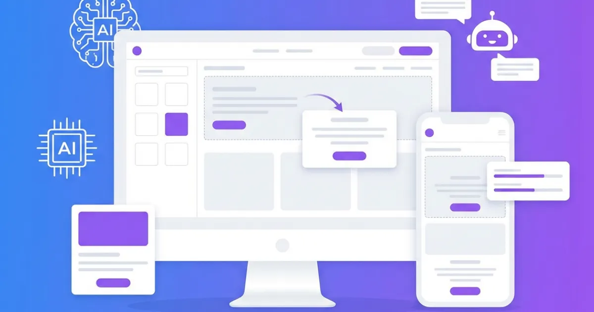
1. Generative AI Is Eating the Design Process
The most notable difference compared to previous years is that artificial intelligence has gone from being a supplement to becoming the main engine of the design process. We're no longer talking about tools that suggest color palettes; we're talking about systems that generate complete websites from a natural language description.
What's interesting isn't the technology itself, but what it enables: a person with no programming knowledge can create a professional website with clean code, optimized SEO, and responsive design in a matter of minutes. This democratizes access to professional web design in a way that traditional drag-and-drop builders never managed, because those gave you visual control but generated inefficient code underneath.
The key is what type of code the AI generates. Tools like SpeakSite produce semantic HTML5 with server-side PHP, optimized Tailwind CSS, and automatic JSON-LD structured data. This means the result doesn't just look good — Google can index it properly, and users with disabilities can navigate it with screen readers. Not all AI tools achieve this: many generate React single-page applications that look spectacular but that search engines can't read.
Why Does This Matter for Your Business?
Because time-to-launch drops from weeks to hours. A freelancer or small business that used to take a month to get online can now iterate their site in an afternoon. And we're not talking about a generic landing page — we're talking about a complete site with a blog, service pages, contact form, and technical SEO handled from the very first moment.
2. Dark Mode: Nobody Wants Your Website to Burn Their Eyes
Dark mode is no longer an exotic option. In 2026, most operating systems, browsers, and applications either have it enabled by default or offer it prominently. Users now expect your website to respect their system preference, and if it doesn't, the experience feels disconnected from the rest of their digital environment.
But implementing dark mode correctly goes far beyond inverting colors. A good dark design requires:
- Elevation hierarchy with surfaces: instead of using a single black (#000000), layers of dark gray with different luminosity are used to create depth. The most important or "elevated" elements use slightly lighter tones.
- Calibrated contrast: pure white text (#FFFFFF) on pure black creates too much contrast and visual fatigue. Professional designers use softened whites (like rgba(255,255,255,0.87)) for body text and lower opacities for secondary text.
- Adjusted accent colors: colors that work on white backgrounds can be too bright on dark backgrounds. It's necessary to reduce saturation or adjust the hue to maintain readability without sacrificing visual identity.
- Adapted images and graphics: images with white backgrounds create an annoying "flash" in dark mode. Designers should consider alternative versions or apply subtle filters.
From a technical standpoint, the implementation relies on the CSS prefers-color-scheme media query, which automatically detects the user's operating system preference. Combined with CSS custom properties, it allows creating a theme system that adapts without additional JavaScript.
3. Micro-Interactions: What Makes a Website Feel "Alive"
A micro-interaction is any animation or visual response that occurs when the user does something: hovering over a button, submitting a form, scrolling through the page, or clicking a menu. Individually they're imperceptible, but collectively they define whether a website feels "alive" or "dead."
What's changed in 2026 isn't the concept, but the sophistication and accessibility of implementation. Native browser APIs like the View Transitions API and CSS Scroll-Driven Animations allow creating smooth page transitions and scroll-linked animations without resorting to heavy JavaScript libraries.
Examples That Actually Move the Needle
- Buttons with state feedback: a button that slightly changes size, color, or shows a spinner on click confirms to the user that their action was registered. This reduces the "did it work?" anxiety that generates duplicate clicks and abandonments.
- Section transitions: as the user scrolls, elements appear with a slight vertical displacement and fade-in. These aren't flashy animations — they're subtle 300-500ms transitions that guide attention.
- Progress indicators: in long forms or checkout processes, an animated progress bar reduces perceived effort and decreases abandonment by up to 20%.
- Real-time validation: form fields that show a green check or error message as the user types, without waiting for submission. This reduces frustration and increases completion rates.
Important caveat: all animations must respect the prefers-reduced-motion operating system preference. Users with vestibular disorders, epilepsy, or other conditions may experience dizziness or discomfort from excessive animations. A professional site reduces animations to minimal duration when this preference is active, without eliminating them completely.
4. Glassmorphism and Layers: Pretty Yes, But Also Functional
Glassmorphism (translucent surfaces with background blur, technically known as backdrop-filter: blur()) has established itself as a visual language that communicates modernity and sophistication. Apple uses it extensively in macOS and iOS, and its adoption in web design has grown exponentially.
However, the 2026 trend goes beyond the decorative effect. Layer-based design uses translucency as a tool for functional visual hierarchy:
- Floating navigation with glassmorphism: fixed headers with translucent backgrounds let users see the content behind them, maintaining context while navigating. This is especially useful on long landing pages where always-visible navigation reduces bounce rate.
- Cards with depth: instead of cards with solid borders, modern designs use semi-transparent backgrounds with subtle borders (
border: 1px solid rgba(255,255,255,0.08)), creating a sense of depth without aggressive shadows. - Contextual modals and overlays: modal windows with blurred backgrounds keep the user oriented, reducing the disorientation caused by traditional opaque modals.
Performance consideration: the backdrop-filter effect has a significant GPU cost. On low-end mobile devices, excessive use can cause framerate drops. Best practice is to limit the number of elements with this effect active simultaneously on screen and use will-change: transform, opacity to optimize rendering.
5. Variable Typography: One Font to Rule Them All
Variable fonts are probably the most important typographic innovation of the last decade for the web. Instead of loading separate files for each weight (regular, bold, semibold), width, and style, a variable font contains all variation axes in a single file.
Why does this matter for web design?
- Performance: a single variable font file weighs less than three or four static font files. Fewer HTTP requests and fewer bytes transferred means better LCP (Largest Contentful Paint) and better Core Web Vitals scores.
- Design flexibility: you can use exact intermediate weights (like 450 or 550) that didn't exist in static fonts, achieving more refined typographic hierarchies.
- Typographic animations: the axes of a variable font can be animated with CSS, creating effects like text that "thickens" on hover or headings that change weight based on scroll.
- Responsive typography: combined with
clamp(), variable fonts allow text size and weight to adapt fluidly to viewport width, without abrupt jumps between breakpoints.
Fonts like Inter (which this very website uses), Poppins, and Roboto Flex already offer variable versions. Google Fonts has been progressively migrating its catalog to variable formats, making adoption much easier.
6. Truly Mobile-First, Not Just Lip Service
Since Google implemented mobile-first indexing, designing for mobile first went from being a recommendation to a survival requirement in search. However, many websites are still "desktop-first with responsive adaptation," which shows in the user experience: text too small, buttons hard to tap, and layouts that feel squeezed.
True mobile-first design in 2026 means:
- Touch targets of at least 44x44 pixels: accessibility guidelines (WCAG 2.2) establish that interactive elements must have a touch area of at least 44x44 CSS pixels. 32px buttons with 8px padding aren't enough.
- Eliminating hover as the primary mechanism: on touch screens, hover doesn't exist. If a dropdown menu only works on hover, you're excluding more than 60% of worldwide web traffic.
- Prioritized content, not just stacked: true mobile-first means deciding what content is essential and showing it first, not simply stacking all desktop blocks into a column.
- Forms optimized for mobile keyboards: using
inputmode="email",inputmode="tel", andautocompletecorrectly. These attributes make the mobile keyboard show relevant keys (@ for email, numbers for phone), reducing friction.
7. Accessibility: If Your Website Isn't for Everyone, It's Not Finished
Web accessibility (a11y) has gone from being a "nice to have" to a legal requirement in most markets. The European Accessibility Act comes into full effect in 2025, and in the United States, the ADA is being applied to websites with increasing frequency. But beyond legislation, accessibility is simply good design: an accessible site works better for everyone, not just people with disabilities.
The pillars of web accessibility that every site must meet:
- Semantic HTML: using
<nav>,<main>,<article>,<header>,<footer>instead of generic divs. Screen readers use these tags to let users jump directly to the section they're interested in. - WCAG AA color contrast: minimum ratio of 4.5:1 for normal text and 3:1 for large text. It's not just about "looking good" — there are people with low vision or color blindness who depend on sufficient contrast.
- Keyboard navigation: everything that works with a mouse must work with a keyboard. Focus indicators (
:focus-visible) must be visible and clear. - Descriptive alternative texts: every image must have an
altattribute that describes what it shows, not generic text like "image" or "photo." - Form labels: every form field needs an associated
<label>. Placeholders are not substitutes for labels.
Tools like SpeakSite generate semantic HTML5 with ARIA attributes, correct heading hierarchy, and alt tags by default, meaning a site built with AI can be born accessible without the creator needing specialized knowledge.
8. Performance: What You Can't See but Definitely Feel (And Google Knows It)
Performance isn't glamorous and doesn't generate headlines on design blogs, but it's the factor that most directly impacts business results. The data is clear:
- A 1-second delay in loading reduces conversions by 7% (source: Akamai and Google studies).
- 53% of mobile users abandon a site that takes more than 3 seconds to load.
- Google has been using Core Web Vitals as a direct ranking factor since 2021.
In 2026, the performance practices that make a difference are:
- Images in modern formats: WebP and AVIF offer the same visual quality as JPEG with 25-50% less weight. The
<picture>element with fallbacks allows serving the optimal format based on browser. - Smart lazy loading:
loading="lazy"for below-the-fold images, butloading="eager"andfetchpriority="high"for the main (hero) image. Poorly applied lazy loading can worsen LCP. - Inline critical CSS: the CSS needed to render the first screen is included directly in the HTML, avoiding an additional blocking request.
- Minimal blocking JavaScript: sites that depend on heavy JavaScript frameworks to render static content unnecessarily penalize Core Web Vitals. Server-side HTML with selective hydration offers the best balance between interactivity and performance.
This is an area where the choice of creation tool matters enormously. AI website builders that generate React SPAs produce JavaScript bundles that can exceed 200KB compressed before showing a single line of text. In contrast, a site generated with server-side PHP (like those SpeakSite produces) sends render-ready HTML, with a significantly lower Time to First Byte.
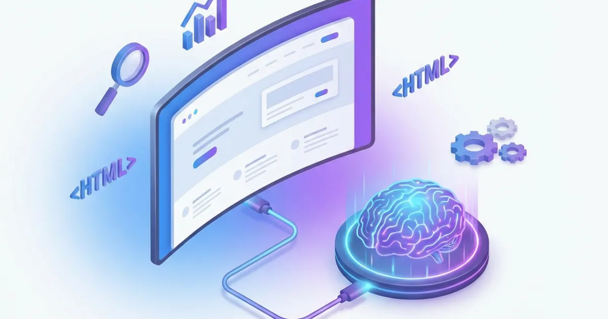
9. Technical SEO from the First Sketch, Not After
A trend that has finally consolidated in 2026 is the integration of technical SEO as part of the design process, not as a post-launch optimization. Teams that separate "first we design, then we optimize for SEO" end up with sites that require costly refactoring.
Modern technical SEO that should be present from the design phase includes:
- Semantic, predictable URLs:
/services/web-designinstead of/page?id=47. The URL structure should reflect the site's information architecture. - JSON-LD structured data: Schema.org markup that allows Google to show rich snippets (stars, prices, FAQs) directly in search results.
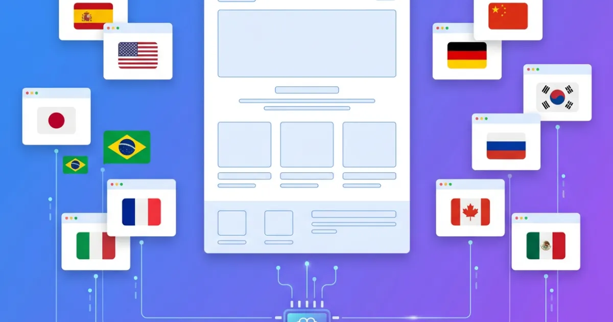
- hreflang tags for multilingual sites: they tell Google which language version to show each user, avoiding duplicate content issues between languages.
- Automatic XML sitemap: an up-to-date site map that helps search engines discover and index all pages.
- Open Graph and Twitter Card meta tags: so that when someone shares your page on social media, it appears with an optimized title, description, and image.
Platforms like SpeakSite implement all these elements automatically when generating the site. When you create a new page or publish a blog post, the system generates structured data, updates the sitemap, configures meta tags, and adds the corresponding hreflang tags — all without manual intervention. This contrasts with platforms like WordPress, where you need to install and configure three or four different plugins to achieve the same result.
10. Conversational Design: Editing Your Website by Talking to It
The last trend worth noting is conversational design applied to web creation and editing. Instead of interfaces with dozens of menus, panels, and options, the most modern tools let you modify your website by speaking to it in natural language.
We're not talking about generic chatbots embedded in the page. We're talking about the ability to say "make the contact button bigger and green" and have the change applied immediately. Or drawing on the site preview to indicate where you want to move an element. This form of interaction dramatically reduces the learning curve and makes web editing accessible to people who would never open a code editor or a WordPress dashboard.
SpeakSite implements this conversational design paradigm: you can edit your website via text chat, voice commands, or drawing on the preview. The AI interprets your intent and generates the corresponding code, always maintaining consistency with the project's style guide.
How to Apply These Trends to Your Project
Knowing trends is useful, but what really matters is how you apply them. Here are concrete recommendations based on your situation:
- If you're starting from scratch: choose a tool that implements best practices automatically (semantic HTML, technical SEO, accessibility, performance). That way you focus on content and value proposition, not technical infrastructure.
- If you're redesigning an existing site: prioritize performance and accessibility before visual effects. A fast, accessible site with simple design outperforms a slow site with spectacular animations across every metric that matters (conversion, ranking, retention).
- If you're a freelancer or agency: invest in understanding variable typography and native dark mode. These are details that elevate the perceived quality of your work and that few competitors implement correctly.
- If you have a local business: focus on mobile-first, loading speed, and LocalBusiness structured data. These three factors have more impact on your local visibility than any visual trend.
Web design in 2026 is no longer measured by how spectacular a site looks, but by how well it works: how it ranks on Google, how it converts visitors into customers, how fast it loads, and how many people can use it without barriers. The tools have evolved to make this more accessible than ever. The question is no longer whether you can have a professional website, but how quickly you can launch it.